Using AI and deep learning to detect anomalous engine monitor data

Nowadays more than half of the piston GA fleet is equipped with some sort of recording digital engine monitor. Older ones tend to be fairly primitive and record just EGTs and CHTs and not much else. Modern ones have myriad sensors and capture numerous temperatures, pressures, voltages, currents, air data, attitude, acceleration, and GPS position data. A modern engine monitor with a few dozen sensors and a one-second sampling rate records more than 100,000 measurements per hour of flight. This data can have immense diagnostic value.
In a perfect world, our engine monitors would analyze all this data in real time and alert us whenever something doesn’t look right. But even state-of-the-art avionics have an extremely limited ability to do this. Some engine monitors will alarm when various data values—CHTs, TIT, oil temperature and pressure, etc.—fall outside user-configurable minimum or maximum values. Others alarm only when values hit the manufacturer-specified redline (which is often way too late to save the day). Yet others offer no alarms at all.
No engine monitor does what our human data analysts at Savvy Aviation are trained to do: to look for patterns in the various sensor values. If cylinder #3 has an EGT that differs significantly from the other cylinders, is there a corresponding divergence in its CHT that would confirm abnormal combustion, or could it just be a bad EGT sensor or flakey harness? Or if cylinder #1 looks like it was starting to flame out when the pilot leaned for cruise, what was the fuel flow, manifold pressure and RPM, and what were the other cylinders doing?
You get the idea. To really understand what’s going on, it’s necessary to look at lots of different sensor data and integrate it into a coherent picture. Our human analysts do this quite well, but our avionics don’t even try—at least not yet.
Drowning in Data
Here’s the problem: We have more than 5 million flights of piston GA airplanes in our database, with more than 10,000 new flights uploaded each week (and accelerating). Our staff of trained human analysts numbers 10 people. Obviously they can’t look at every new flight that comes in.
Which flights do they look at? Typically the ones that our aircraft-owner clients ask to be looked at, generally because a client believes that their engine is performing abnormally and they’re looking for a pinpoint diagnosis. Maybe a client’s engine hiccupped or started running rough or losing power. Maybe the engine monitor triggered a CHT or TIT or oil temperature alarm. That’s usually when a client will upload flight data and ask us to take a look at it.
We’d really like to do better than that. We want to be more proactive, to detect incipient engine problems that the aircraft owner doesn’t even know he has (yet). To do this, we need to develop computer software capable of studying each new flight that is uploaded and flag only those flights where “something doesn’t look right” in the data so one of our human analysts can take a look at it. If our human analyst agrees with the computer, the analyst will reach out to the aircraft owner with an alert and hopefully a diagnosis.
How can we teach the computer to flag anomalous flights? That’s where the story gets interesting…
Generalized Anomaly Detection
Our company’s Skunk Works is pilot-testing a project codenamed GADfly—“GAD” stands for Generalized Anomaly Detection and “fly” is obvious—to automatically flag anomalous flights as they are uploaded. Initially our testing is focused on Cirrus SR22s because they tend to be equipped with lots of sensors and we have close to a half-million SR22 flights in our database. If GADfly proves effective for the SR22, we plan to extend the program to many other airplane makes and models.
Here’s how GADfly works: The engine monitor in an SR22 captures data from about 50 different sensors at a rate of one observation per second or 3600 observations per flight hour. Now, imagine that each observation is plotted as a point in 50-dimensional space. A typical hour-long flight will result in 3600 points. If we do this for the half-million SR22 flights in our database, we’ll wind up with roughly two billion points plotted in 50-dimensional space.
The vast majority of those points will be tightly clustered into a 50-dimensional “blob” that represents what normal data looks like for the SR22. The edges of the blob will be a little fuzzy, and there’ll be a relative handful of points that are obvious outliers because they fall well outside the body of the blob.
In the jargon of artificial intelligence (AI) and machine learning (ML), this 50-dimensional blob is known as “training data” and the 50 data elements captured by the engine monitor are called “features.”
Now, suppose a new SR22 flight gets uploaded to the system. The software takes each one-second observation and plots it in 50-dimensional space to see where it falls. If it falls inside the blob then it’s probably normal, but if it falls outside the blob or on its edges, it’s probably anomalous—the further outside the blob it falls, the more anomalous it’s likely to be. We do this for each of the thousands of observations in the flight, and if more than a few observations seem to be anomalous, we’ll flag the flight to be reviewed by a human analyst.
Although this is conceptually simple—at least for those of you who can visualize a 50-dimensional blob—the devil is in the details. The mathematics of deriving an “anomaly score” for each observation and for the flight as a whole is quite complex. GADfly does it using a multi-level neural network, a process AI geeks call “deep learning.” We were fortunate to be able to utilize a neural network ML model developed by Google machine learning engineer (and GA aircraft owner) Dr. John Sipple. A huge shout-out to John and Google for open-sourcing the algorithm and making us aware of it.
GADfly Oversimplified
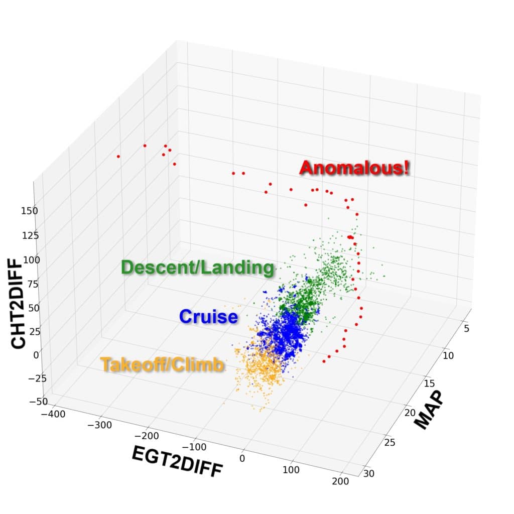
It’s hard to visualize a 50-dimensional blob, but most of us are reasonably adept at visualizing things in three dimensions. So, let’s take a look at an oversimplified version of the anomaly detection model with just three features instead of 50. For purposes of this exercise, we’ll choose CHT and EGT for cylinder #2, plus manifold pressure (MAP). To make this 3D model work a bit better, we’ll normalize CHT2 and EGT2 by subtracting the average CHT and EGT of the other five cylinders, and call the normalized features CHT2DIFF and EGT2DIFF.

When we plot these three features from a large number of SR22 flights from out database, you can see that we get a nice well-defined 3D blob that represents what normal data looks like. The orange dots come from the takeoff/climb phase, the blue dots from cruise, and the green dots from descent. These dots are quite tightly clustered in 3-space.
Now look at the red dots. There are quite a few of them, and they fall well outside the blob, suggesting that they are clearly anomalous. What’s with those?

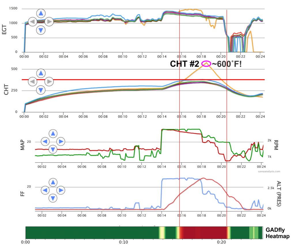
Well, it turns out that the red dots all came from one particular flight, and it was a very anomalous flight indeed. If you look at the SavvyAnalysis chart for that flight, you’ll see that shortly after the pilot applied takeoff power the #2 cylinder went into heavy detonation which morphed into destructive pre-ignition and made a melted mess of the #2 piston. Even if you’re not accustomed to looking at charts like this, thermal runaway of #2 CHT is quite obvious.
Below the chart, you’ll see a “heat map” generated by the GADfly model indicating the “anomaly score” for each phase of the flight, with low scores (normal) shown in green and high scores (very abnormal) shown in red. Note that the portion of the flight with the highest anomaly scores corresponds precisely with the abnormal detonation/pre-ignition event.
Keep in mind that GADfly knows nothing about detonation or pre-ignition—all it knows is that the data for that portion of the flight “doesn’t look right” and so a trained human analysis ought to take a look. Of course, the human analyst will instantly recognize that the thermal runaway was due to heavy detonation and/or pre-ignition.
The chart shows that the pilot failed to take corrective action—reducing power—to stop the thermal runaway and save the #2 piston from destruction until it was too late. Either his engine monitor didn’t alarm as the #2 CHT rocketed through 400˚F (where the alarm should have been set to go off) on its way to 600˚F, or else the monitor did alarm but the pilot failed to respond appropriately. In any case, it appears that the pilot was oblivious to the destructive combustion event in cylinder #2 until the engine started losing power and running very rough, at which point the pilot finally throttled back his crippled engine and limped back to the runway.
The Future of AI in GA
The GADfly research project is our second venture into applying modern AI and ML technology to the analysis of piston aircraft engine data. (Our first was the FEVA2 failing exhaust valve prediction model that I wrote about in the August 2021 issue of AOPA PILOT.) We have high hopes that GADfly will enable us to be more effective in the early detection and diagnosis of engine problems that our clients didn’t even know they had until we alerted them.
We are brimming over with ideas for using AI and ML to provide actionable intelligence to aircraft owners. Ultimately, we hope avionics manufacturers will become interested in deploying this kind of technology in the cockpit so our engine monitors will be able to do a better job of alerting us when “something doesn’t look right.”
You bought a plane to fly it, not stress over maintenance.
At Savvy Aviation, we believe you shouldn’t have to navigate the complexities of aircraft maintenance alone. And you definitely shouldn’t be surprised when your shop’s invoice arrives.
Savvy Aviation isn’t a maintenance shop – we empower you with the knowledge and expert consultation you need to be in control of your own maintenance events – so your shop takes directives (not gives them). Whatever your maintenance needs, Savvy has a perfect plan for you: